Deana sent me a little note the other day that said, “…Can you share any tips about working with patterns? I am in love with all your work and I would love to hear about how you integrate it into your designs. The color is so great and any tips would be so appreciated!…”
Of course, Deana! I love working with patterns and colors. Since it’s the time of year for freshening up spaces, I thought sharing some fun ideas for the new year {and the doldrums of winter} would be a timely subject to cover. If you stick with these elements of design, I’ve found you can’t really go wrong. Here are 5 Easy Tips for Working with Patterns. {And a few helpful tips at the end, to boot.}

A large piece of art in organic shapes is the focal point here, then tied together with geometric sheets + pillows. The bedspread itself holds organic shapes in one solid neutral, paired with a small quilt at the foot with smaller florals. It’s an example of how all the rules we’ll discuss below are used together.
{Flanking busier combos in solid colors helps tie it together.}

It’s always good to consider repetition when open spaces are visible from one room to the next.
Helpful Tip: Over time, I subconsciously do things without realizing why because I’ve been doing it for so long, but when I stop to think about it, these are the processes I use. For application’s sake, the elements of design are related and intertwined to achieve a cohesive final look, so it’s great to consider all these and apply them together. In other words, no concept can exist independently without considering the others when it comes to planning a room. Because of that, you may see the same concept applied in various ways – So, without further ado…

Not just for fabrics: this little bath was a difficult one to photograph, but the organic shapes in the wall tile work with the scale and geometric nature of the floor + shower.
1. 5 Easy Tips for Working with Patterns: Contrast
When searching for options, I go with contrast first. Find the first pattern you love, and then find others to complement in their contrast. So, for example, if you find a floral you love, stripes will always be a safe bet. When it comes to contrast, start with something simple and think about the relationship between organic shapes + geometric shapes within the pattern. I find the design can get away from you very quickly when too many organic patterns are incorporated into a space -unless that’s the intent {For example, some children’s rooms are really fantastic with a lot of patterns, but it’s always good to have a sense of control and intention over the final aesthetic.}

This can apply to something as simple as a fun rug, and a striped pillow
2. 5 Easy Tips for Working with Patterns: Scale
Scale is an essential element to consider when looking at patterns within a space. It actually comes down to large vs. small. And that brings us back to the element of contrast above. For example, it’s easier to pair two organic patterns together in something like florals if we have a large floral and then a small floral. So consider the scale of all the patterns you’re bringing together to make sure you have a variety of options when using them in a space.

Many patterns were used in this kids’ bunk space with a beach house style to help bring it to life. The key elements are a combination of scale, color, contrast, and then repetition, which helped bring it together.

3. 5 Easy Tips for Working with Patterns: Color
One of the very best ways to tie your patterns together is through the use of color. If you have a tone somewhere in one pattern, it’s best to incorporate it with another so that the design feels intentional and cohesive. It’s one of my favorite tools for a one-of-a-kind, finished look. Be mindful of how those are incorporated into the space; you can’t go wrong. I’d also speak to the idea of diversity and range when it comes to color. It can be your friend, and it’s a tool a lot of people just don’t know how to utilize well. {see: a lot of influencers.}

I played with scale and color here to combine too mainly organic patterns. But the rug is dominant over the wallpaper, because of the bolder color and scale. The stripes in the pillows complement the design.
4. + 5. 5 Easy Tips for Working with Patterns: Repetition and Balance
These two points go hand in hand because using one creates the other. If you repeat the same pattern {you can do this just as easily with color within the pattern} throughout a space; it gives a sense of a finished, polished look. It also creates a sense of balance in the space. This is an integral element to integrate into your rooms and take the look to the next level. This applies to color, scale, and more – not just patterns. It’s basically the key.

Here’s an example of an asymmetrical space where repetition was subtly used. I laid out the elements on a design board for clients to see how the color would be repeated throughout the art, rug, pillows, and more.

These elements aren’t exclusive to fabrics + textiles, only. Here, the geometric tile pattern on the wall pairs nicely with the bolder organic rug, while pillows serve as smaller accents
in solids and geometric stripes + plaids.

You could apply these rules to your next bathroom redo.
Do you see how the tips above can easily be applied and substituted for others? They’re all related in a way that can be easily applied. Here are a few more things to consider when applying these concepts:
A. As a general rule, for longevity’s sake, I keep more significant pieces of furniture in a solid or subtle geometric pattern. {The exception would be thrifted pieces or antiques, or if you generally enjoy lighting money on fire} That way, it’s easier to switch accessories in the future for an entirely different look when it’s time for a refresh. I don’t know about you, but I’m not investing in a new sofa every three years because I do not, in fact, enjoy lighting my money on fire. #College

This space holds organic wallpaper in a feature wall, simple striped chairs with solid furniture, a striped rug + a subtle geometric pattern on the fireplace. The rest of the patterns here are multiple combos, but tie together with color and scale.

Here, we used layers of geometric layered with solids, and a soft sheet set with organic shapes, for this layered dorm room.
B. Consider focal points to create a sense of hierarchy in the space. This is where the ideas of balance, repetition, color, scale, and contrast come together to take that design to the next level. Decide which pattern you want the eye to be initially drawn to upon entering the space and which ones will be considered secondary. It’s a great way to establish a classic look lasting for years to come.

A glimpse into our butler’s pantry showcases an organic wallpaper pattern paired with bold geometric plaids on the floor. I considered scale when I brought in the smaller tile for the backsplash. It’s all tied together with color and balances out with natural elements and softer paint colors. I also love the contrast with the herringbone pattern in the hallway.

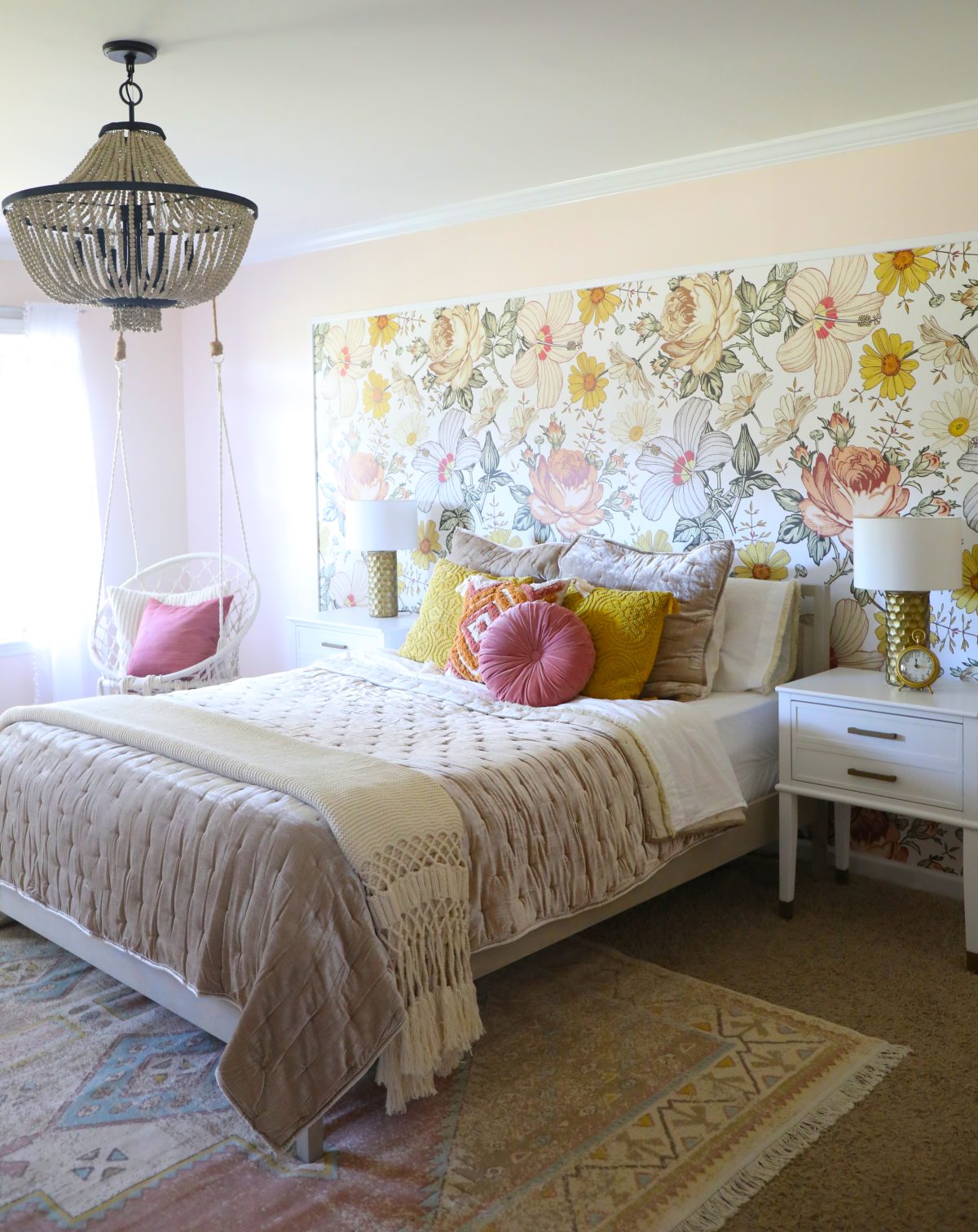
Keeping this fun pattern confined to a headboard space prevented the room from feeling too “busy.” Repeating it in the desk area helped tie the space together. It looks refined and intentional.

C. The amount of pattern matters. This one also applies to point {A} above, but always be intentional about how much pattern you want in a space. Too much can feel overwhelming and make the room too busy. To be blunt, it looks like you don’t know what you’re doing. True story. A touch of restraint is always beneficial unless you want to redesign said space every three years.

D. There are always exceptions. Obviously, we’re always big proponents of doing what you love. The elements of design exist for a reason, so we hope you find these helpful. It’s always useful to consider these when creating a cohesive space!
Thanks so much for tuning in, and as always, please let us know if it’s helpful. Have an inspired day!


