


Over my 18 years of blogging and content creation, I’ve received so many design dilemma questions from readers. I noticed that many of questions repeat again and again over the years.
I started taking note of the top requests for help, and gathered the top five design and decor dilemmas many of you have asked about!
1. Downplaying an ugly TV
This is a BIG dilemma I hear about often! I don’t necessarily mind a television in a space, but I completely understand not wanting it to be the design focus in a room.

This post may contain affiliate links for your convenience.
I may earn a small commission when you make a purchase through links.
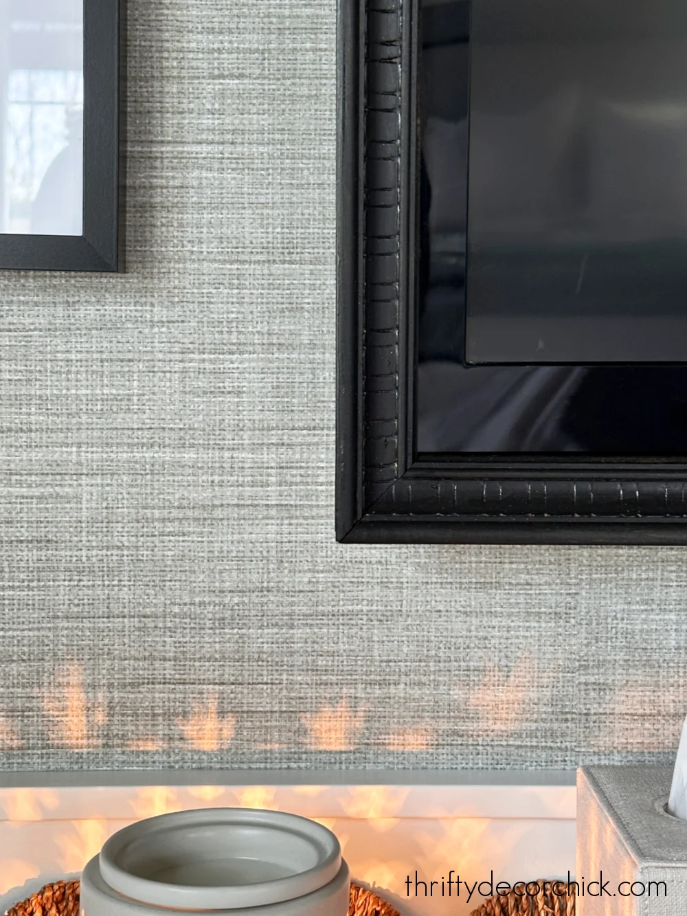
This DIY works on almost any flat screen TV and I think it really does make a difference — the little decorative accent makes it feel more cohesive and intentional in a space.
On one of our televisions I had to accommodate for the remote sensor, so keep that in mind.

If you don’t have this type of TV, you can still display a lovely image on screen using YouTube (as long as you can access that through your television). Just type in the kind of artwork in the search bar, and there are SO many great options — some static and some that have slight movement and soft music.
That’s what I do in our bedroom occasionally — mostly just for photos (or when we’re entertaining and someone may need to use our restroom).
Hanging art around the television is another way to help it flow with the rest of your decor:

Another easy fix that helps your TV blend in is to paint the wall with a dark paint, like the dark blue Cyberspace paint color in our family room above. When the TV is completely off, it’s still obvious of course, but it’s not nearly as jarring.
I’ve done the dark paint behind a television many times over the years:


If a dark black TV bugs you, one of these fixes may help!
2. Making open concept feel cohesive
We’ve lived in two homes with open concept designs, and I still love it despite the trend back to more closed off spaces. If you entertain a lot, the open flow is fantastic.
But I have realized that designing these open spaces is a little more nuanced. It can be difficult to make each room flow (and not get too busy) when you can see all of the rooms at the same time. 😂
Plus, you don’t want rooms to look too repetitive or boring.
In our open concept, I’ve been very purposeful with how I’ve used color in our main living spaces. I used a beautiful dark green called Vintage Vogue in my office, with blue accents in the decor and rug:

I incorporated those blue accents because I love the color, but also to tie into the family room a few steps away:

Green and blue work so well together, so it was easy to bring green tones into this room — mostly with our plants. I also painted a family room bookcase the same dark green color as my office:


So I pulled that wine color into our adjacent dining room as well:

And just recently, I found these beautiful vintage (uhhh…the 90’s are vintage now!! 😩) dark blue lamps second hand and thought they would be lovely in our entryway:

I LOVE them. The blue looks great with the huge wallpaper mural, but also ties in well with the dark blue fireplace and built ins in the great room down the hall.
Keeping these colors flowing from room to room is something that doesn’t look blatantly obvious, but feels comfortable and calming as you walk through our home.
3. Furniture layout in open concept
This one ties in nicely with designing a comfortable flow through open spaces. I encourage you to pull your furniture away from the walls, especially in open concept rooms!
Of course, this is kind of a given when you have fewer actual walls to work with, but it can work in a lot of rooms! Often this layout isn’t our go-to, I think because so many of us grew up with very segmented spaces, where all of the furniture was pushed up against each wall (because there were so many of them!).
When I first walked into our great room (when it was just studs), I knew exactly how I wanted to lay out the furniture:

Floating large furniture like this does require a good amount of space. We are lucky to have enough room in this area set up our sofas and chairs like this.
We did the same with the sectional in our basement — I could have placed it back against the stair wall, but floating it in the middle of the room helps to delineate each space:

If you live in an open concept, you know it can feel a bit cavernous. Moving your furniture closer together in the middle of the room makes the large space feel so much cozier!
This can be done in smaller rooms as well. When we were building our home, I had an outlet installed into the floor so I could float a desk in the middle of the office:

I always had a plan to build the wall of bookcases, so that changed up my furniture layout options. But I also didn’t want to sit facing a wall while I worked. I like being able to see outside, or watch the TV. 😊
This tip works particularly well well in gathering spaces like a living or family room — where you want to sit, talk and engage with family and friends.
4. Decorating large walls
This is another one I get asked a TON. It’s a design dilemma I’ve also struggled with over the years.
Over time I’ve realized that less is more when it comes to tall and/or wide walls. So many times, I’ve tried adding something to an awkward wall and almost always end up taking it down.

Eventually my plan is to add picture frame molding to all of the walls on these stairs anyway — that’s another great way to fill a wall without it looking too busy.

This is a great way to utilize smaller artwork on a big wall. If it’s hung within that trim work, it’s so much more visually appealing.
I would avoid hanging a lot of little items on a big, expansive wall. As with a lot of design decisions, I find going larger with artwork is ideal.
Smaller items work better if grouped together, but this works best when the shape/color is uniform:

Over the years I’ve learned that not every surface needs to be covered — it’s OK if there’s an empty wall or some breathing room on bookshelves or coffee tables.
If you’re a maximalist, go for it! But overall I know I’m not the only one pulled to cover every. single. surface. with something, and it’s just not needed.
Sometimes, adding artwork to a giant wall just accentuates how big and awkward the wall actually is!
5. Scale matters: How big or small should I go?
What size light fixture is best? How big should my rug be? Do I need to fill a big room with big furniture? This one concerns so many design and decor choices, so I get why this is such a big issue for so many of us!
This is another one where I err on the side of too large instead of too small. I prefer a larger light fixture, especially in dining and great rooms:

Now if you go WAY too big, it can look ridiculous! But in general if in doubt, try something larger than you’d initially pick out.
This goes for rugs too. The basic design “rules” say that a larger rug is better. For example, you want to step onto a rug when you get out of bed (and walk around it):


With artwork I find the same to be true. A tiny piece of artwork just floats on a big wall:

A larger mirror (or grouping) looks better most of the time.
I hope these tips help as you decorate your home! Do you agree or disagree with my takes on these design dilemmas?
The great thing about decorating is that you can do what you want…it should be fun and you should love being in your own home. In my humble opinion, there really aren’t any rules…just what feels right for you and your family.